Everyday Carry

The everyday carry is simply the things you take with you day-to-day. Of course, items may vary, because not every day is exactly the same, but there are a few constants, so we have curated a few of our favourite basics that feature minimalism in their design (no phones included).


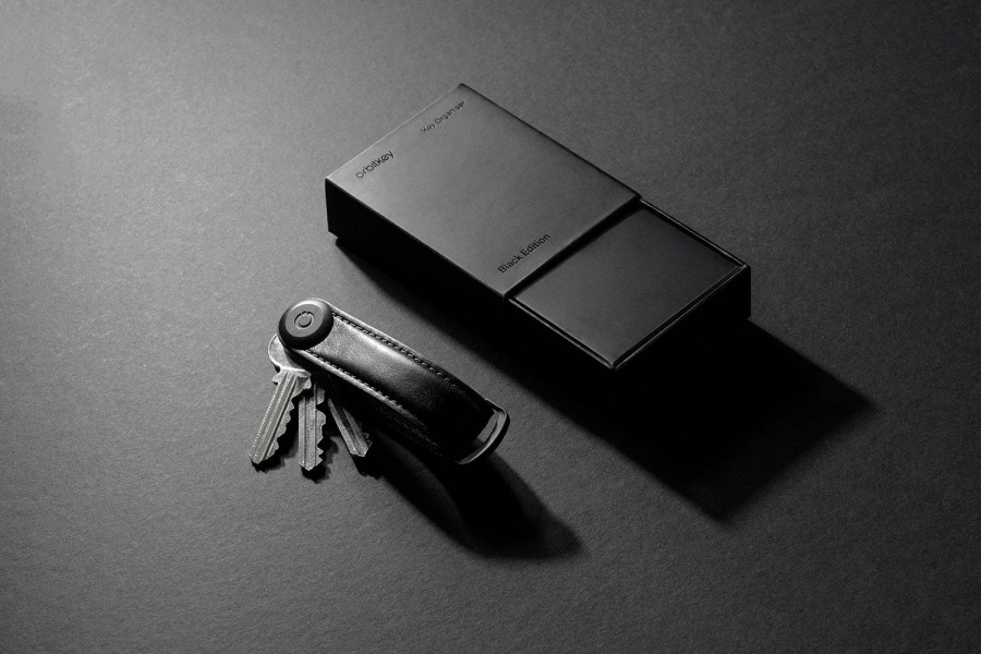
  • Orbitkey Key Organiser
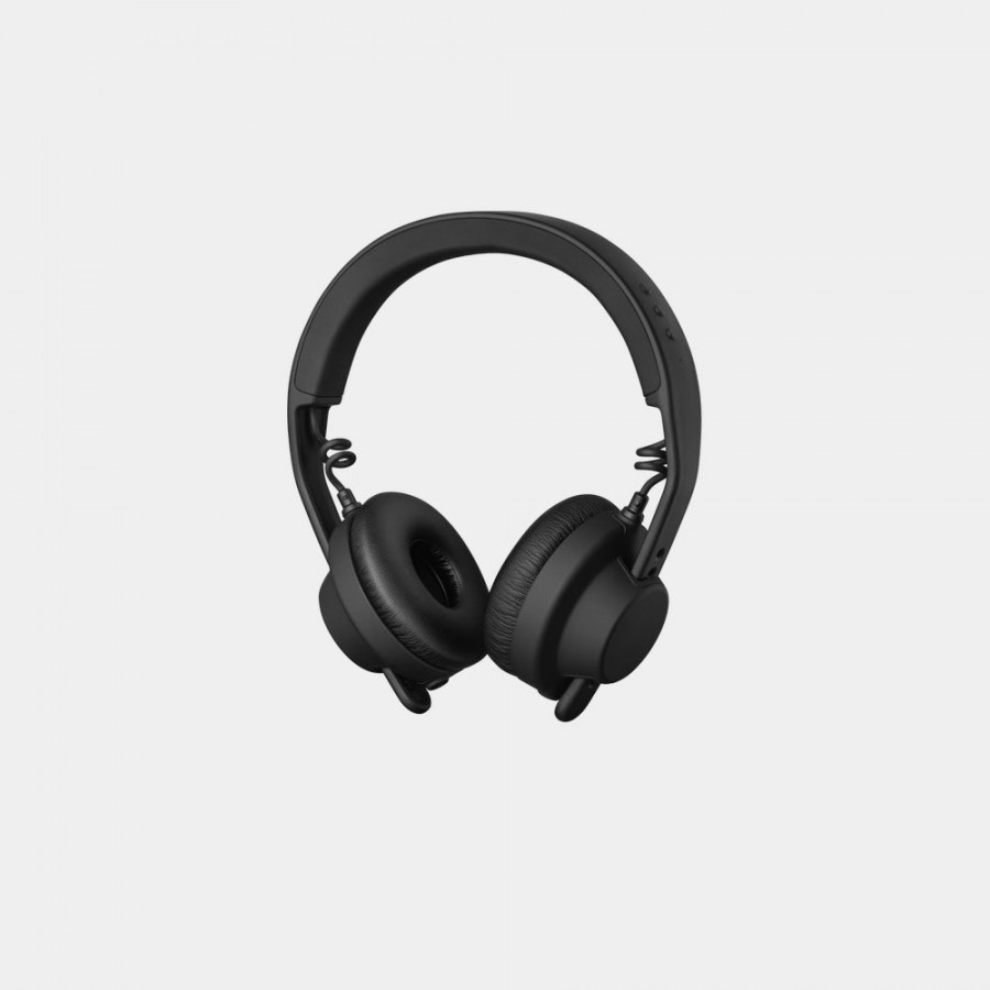
  • AIAIAI TMA-2 Move Headphones
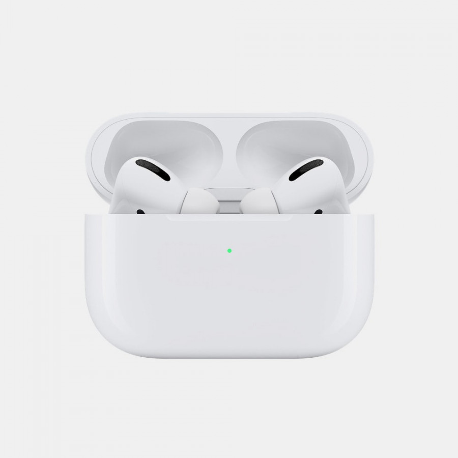
  • Apple Airpods Pro
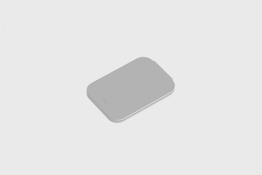
  • CAC Leather Walle
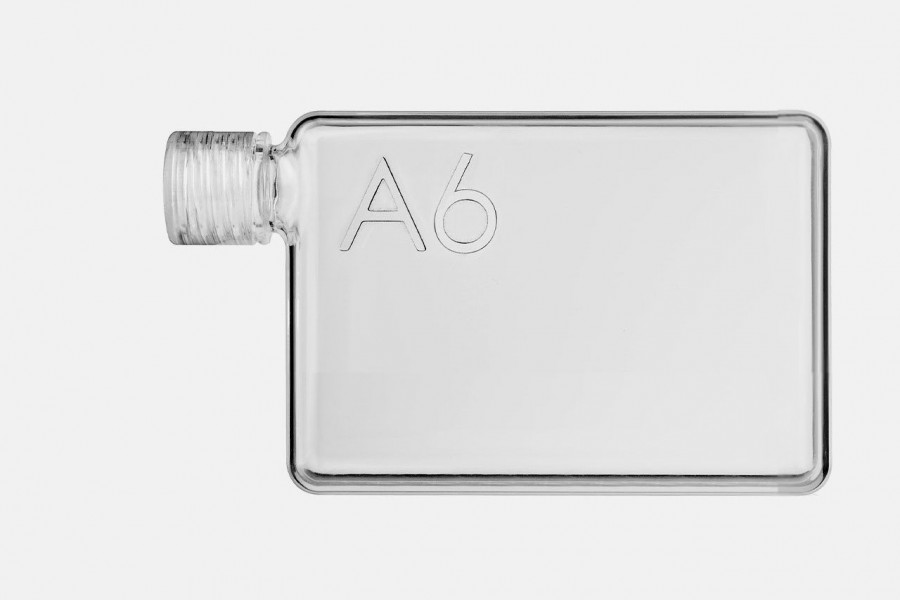
  • A6 memobottle

Kite Chair

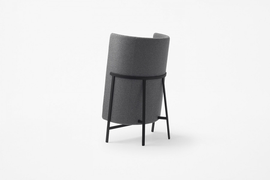
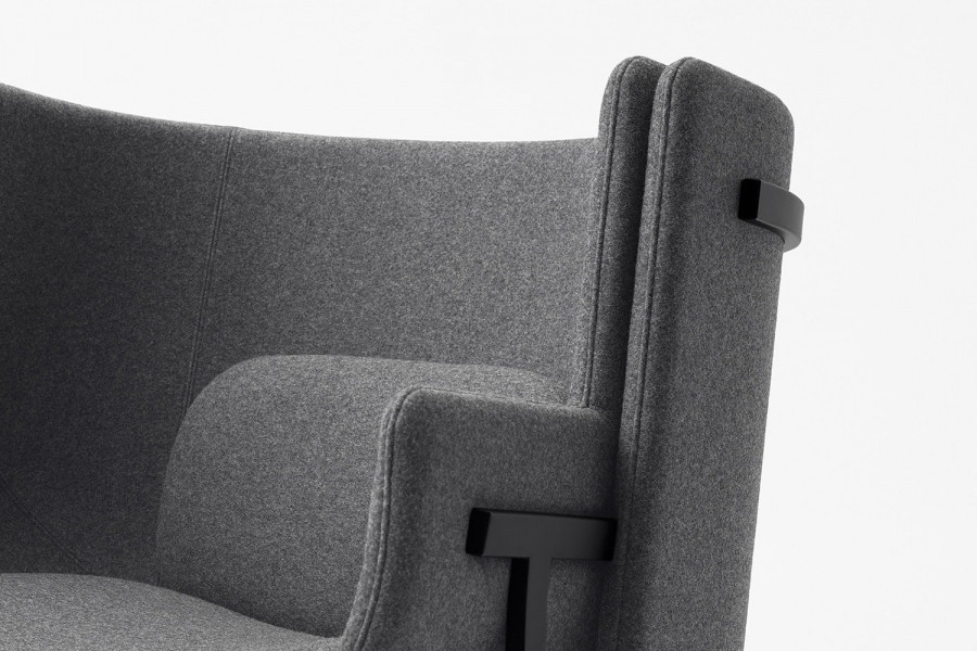
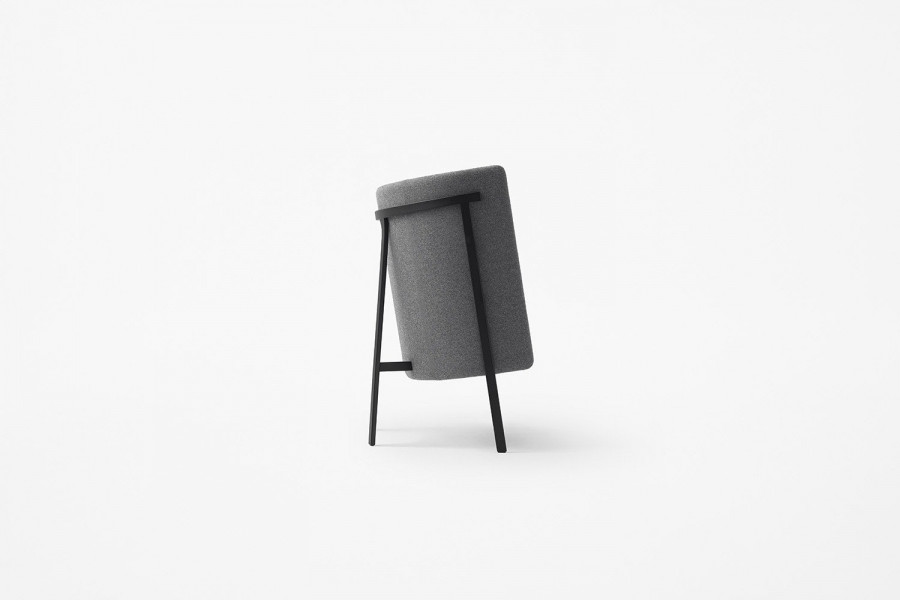
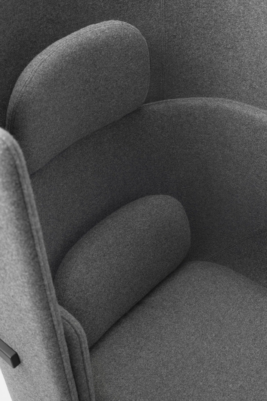
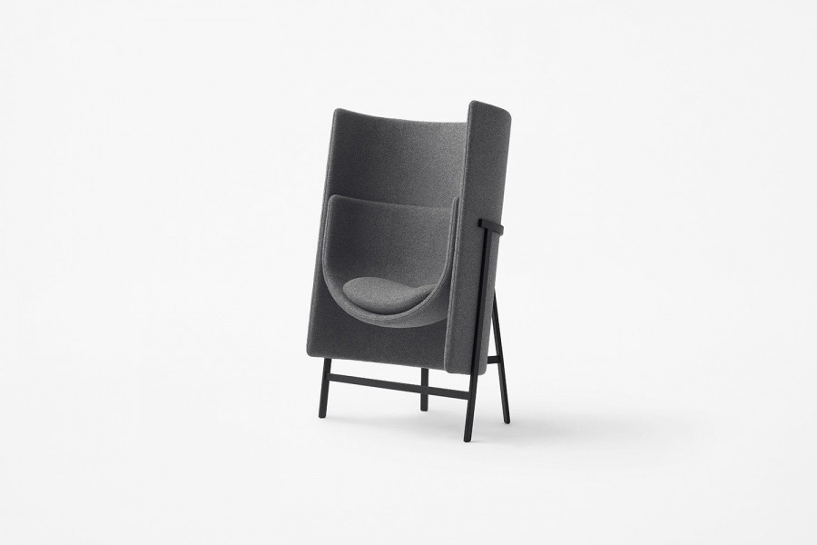
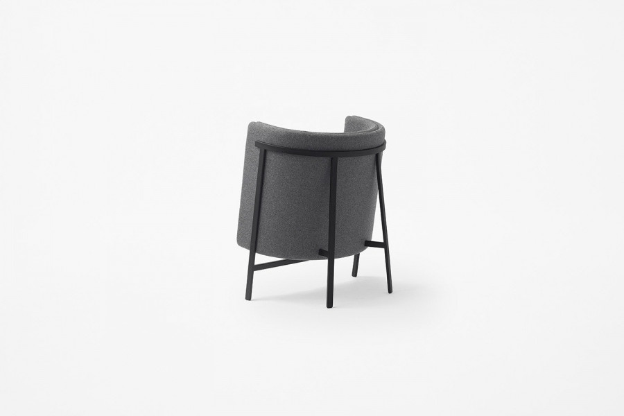
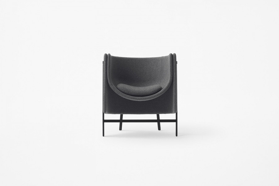
Under the leadership of prolific product designer Oki Sato, Japanese studio, Nendo, shows no signs of slowing down its creativity. Their latest offering comes in the form of Kite—a minimalist armchair designed for common spaces in offices and hotels. Made for furniture producer Stellar Works, Kite is a design that looks to solve a particular problem. There are numerous armchairs and sofas for lobbies and lounges, but those for narrow spaces such as corridors, elevator lobbies, and entrances are difficult to find. Therefore, a compact chair was devised to fit in those niches, for passersby to rest in for a spell or in which to have casual conversation.


Attempts to make an armchair small normally leads one to think of gradual elimination of the backrest to create a bench-like furniture piece. But casting the backrest as the star to which the seat is adjoined yields a design less about sitting and more about leaning against a grand backrest. Such a design takes up minimal space while offering to the chair’s occupant a bit of calm and security.

The modularity of Kite is a key factor in the design. The backrest and seat are independent parts, with shallow and deep seats and lower and taller backs available for use in combination according to the size of the space and degree of privacy desired.

With Kite, it can be argued that form follows function, and considering the problem it addresses, this is no surprise. That is not to say Kite is devoid of aesthetics. Nendo still offers a certain elegance and soft minimalism to the design, particularly the shallow variation of the chair.


Our aim was to inspire a renaissance in Asian aesthetics, taking the forms, styles, and motifs that have characterised Japanese design across the centuries and filtering them through the lens of the European tradition to create something new and timeless.

The collaboration between Nendo and Stellar Works is also something to note. The two share a common design language, bringing together East and West, heritage and modernity, craft and industry—bringing the best of the past into the light of the present.

Knokke Apartment

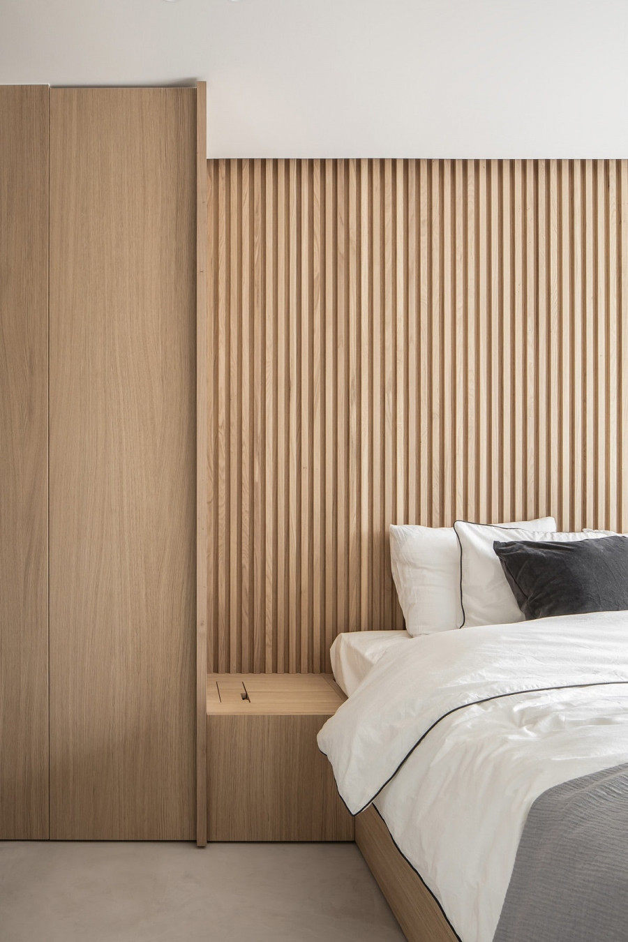
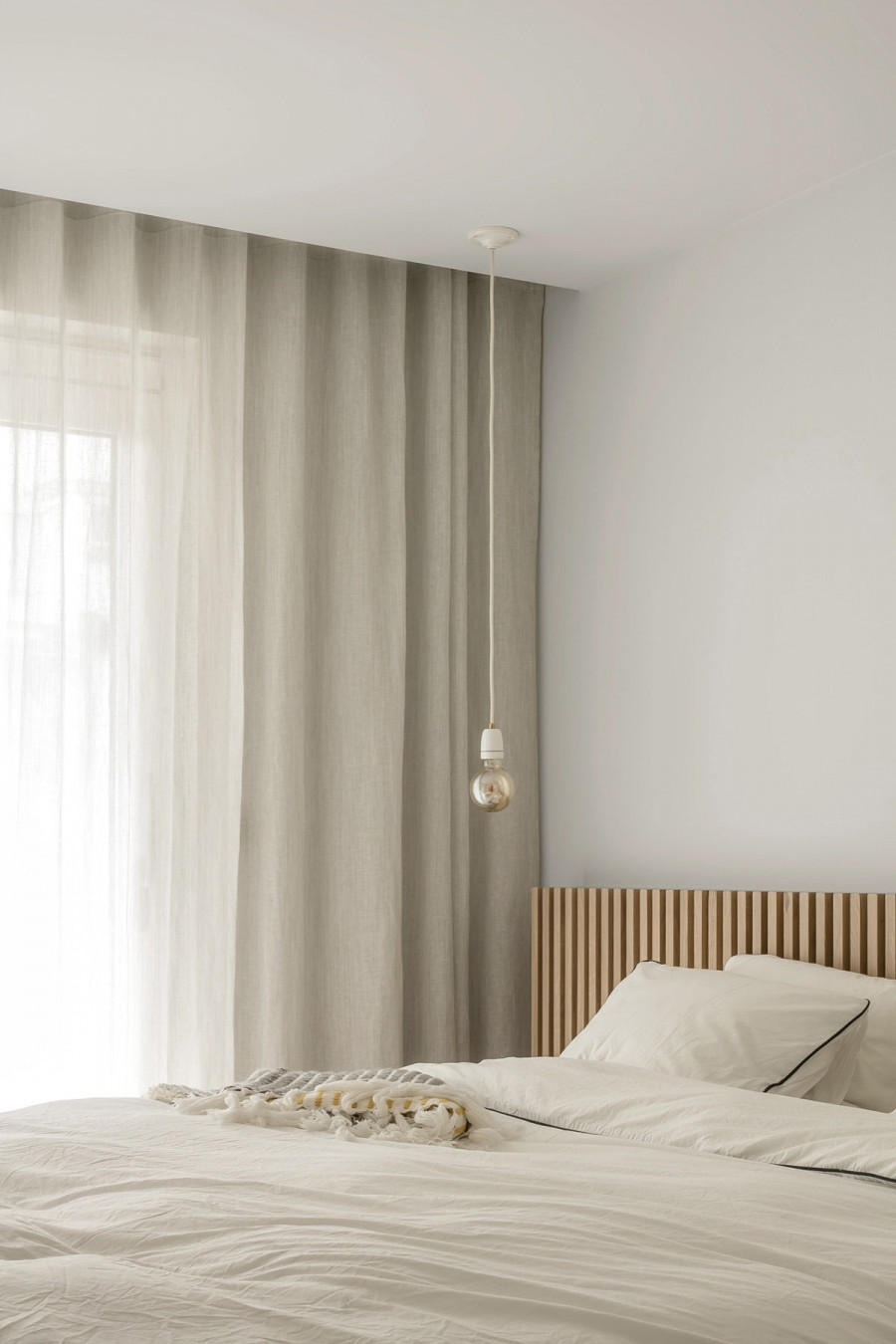
The design of Knokke Apartment focuses on establishing a serene environment for the client. Creating this aesthetic required a few key components: firstly, it was crucial to limit the number of materials and therefore distraction from clashing elements. Secondly, the design had to prioritise a harmonious relationship between inside and outside. As we well know, so many modern structures ignore the surrounding environment to focus on the individual building design. Nils Van der Celen knew that true serenity for the residents was only possible through equilibrium between interior and exterior. Knokke Apartment is a tranquil dwelling where natural materials pair perfectly in a minimal setting.

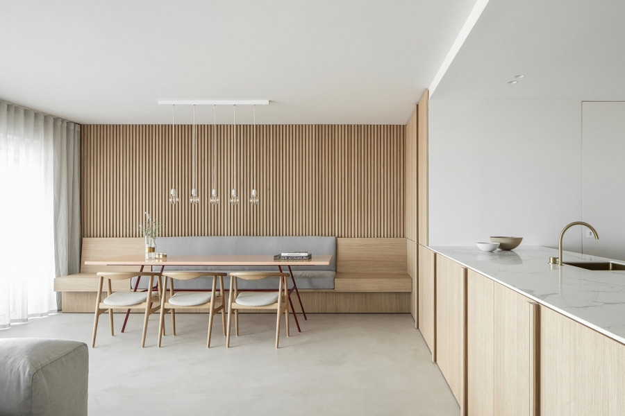
At a moderate 125 square metres, Knokke Apartment has a comfortable floor plan where the different home functions are smartly divided. At the front of the dwelling one enters in to the main living area that includes a sitting room, full kitchen, and built-in dining area. The two bedrooms are quietly stationed in the back of the apartment, with bathrooms and utilities sitting at the core of the residence. It’s a simple floor plan, but smartly crafted to prioritise function and livability.

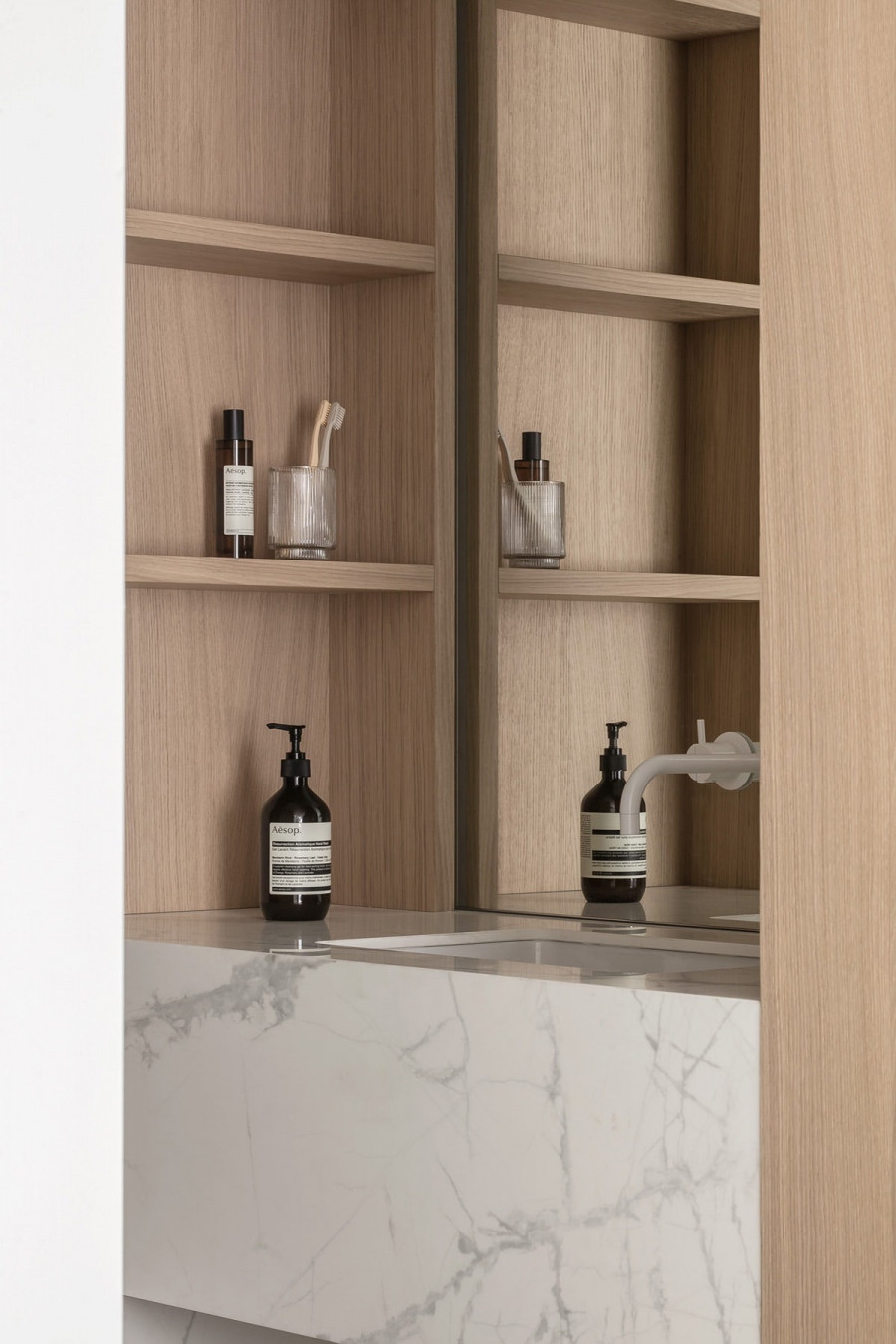
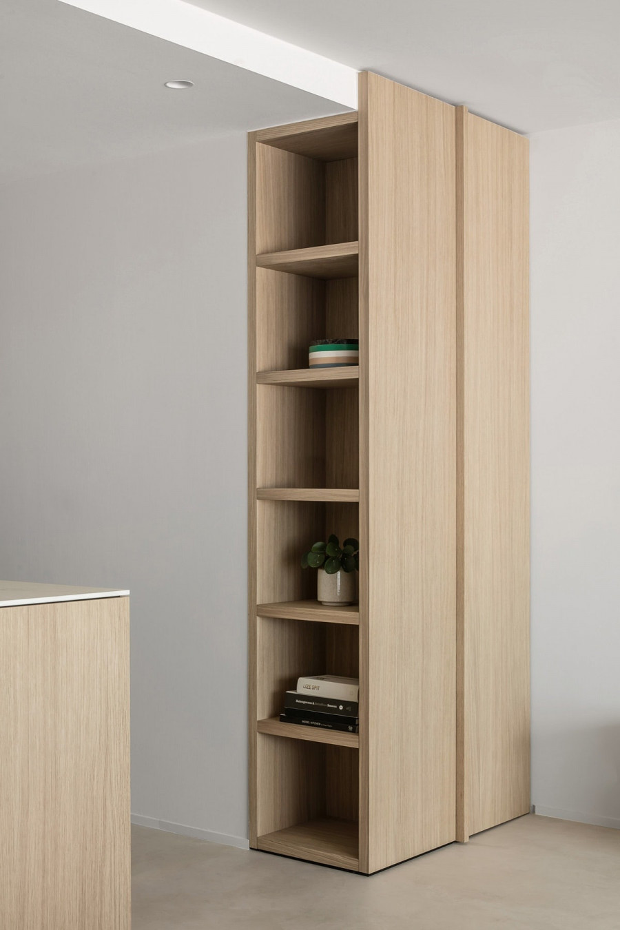
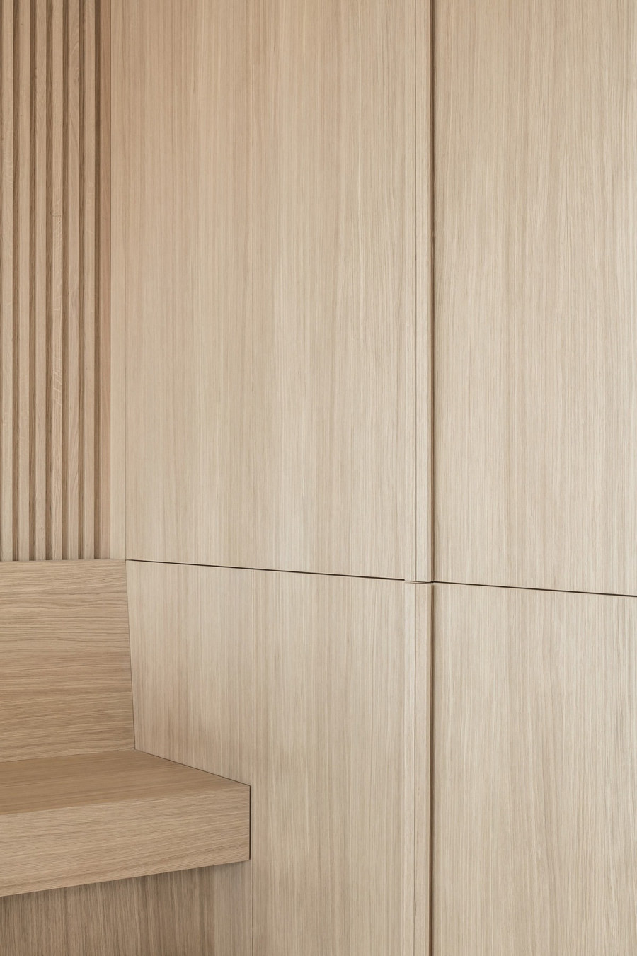
The materials of Knokke Apartment, though there may be few of them, are so gorgeous. Upon first entering the space one is struck by the sheer amount of warm, rick oak. The oak veneer covers most of the walls, cabinetry, and shelving, along with several furniture pieces. Oak is such an memorable material, calling to mind a range of experiences: from traditional hardwood floors to trees in both urban and rural settings. Contrasted with the oak are the other materials in the apartment: concrete and stone. Harder and rougher than the light wood, the stone materials provide accent and depth to the design while also imparting a more modern air. The floors are a creamy shade of grey, polished to near perfection. In the kitchen, our favourite, Carrera marble, reigns supreme. Utilised on the counters and backsplash, the marble, predictably, steals the show. The bathroom counters veer in a more playful and surprising direction with a slab or coloured terrazzo. Terrazzo has been slowly gaining popularity with modern designers as a way to incorporate character and colour while staying within the realm of natural stones.

The furnishings are as much a part of the architecture as any other element of the home. The majority of pieces, such as the dining banquette, bookcases and storage units, and beds, are built-ins. Comprised of the lovely oak, the built-in furniture allows for seamless integration into the apartment, further solidifying the simplicity of the each room. Unique elements such as brass hardware and fluted glass add a touch of luxury, while soft linens provide comfort wherever needed.
Picture Flower Vase

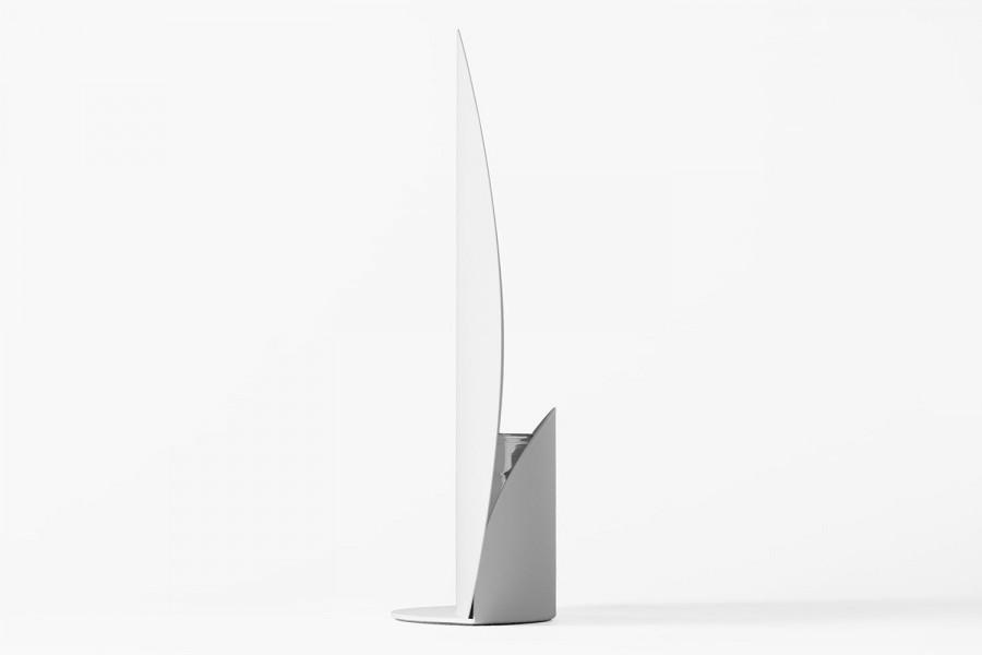
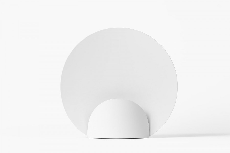
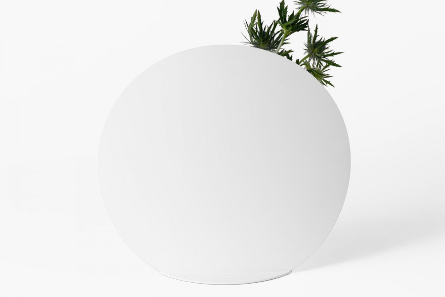
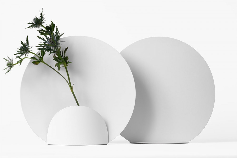
A way to capture and showcase the beauty of a flower as if it were framed like a picture. This is the concept behind Japanese product designer Shinya Oguchi’s latest offering. People are drawn to flowers because flowers are synonymous with beauty. They are delicate, elegant, and dynamic—albeit short-lived. They communicate freshness and vitality without noise. We arguably showcase them in our homes not for decoration, but for how they make us feel in an enclosed space.

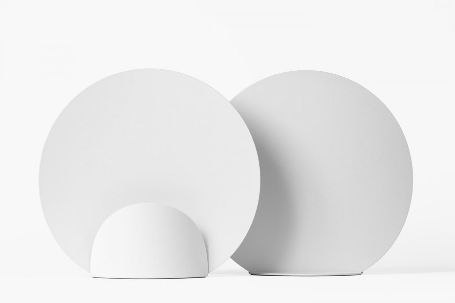
Shinya Oguchi’s Picture is a minimalist and softly formed flower vase comprising three steel elements that form the base and backdrop of the vase. The bent steel plate backdrop measures just 0.88mm in thickness and creates a beautiful blank canvas for any flower stands against it. A smaller rounded steel cover sits at the front of the vase to hide the glass bottle and the base of the stem. To ensure stability, the base features a heavier steel plate measuring 2.3mm in thickness.

This is the third version of the Picture vase design after thorough testing of stabilisation and manufacturing processes saw previous iterations of the design fail. Finally, Shinya has produced a wonderful and understated accessory that will undoubtedly improve the ambience many homes.


Designer: Shinya Oguchi, Website: shinyaoguchi.com

You seem cool

Thanks for visiting. If you’re curious, let’s have a chat. I’m currently based in NZ, and work remotely in most time zones.

Social
©2020 Courtney McConnochie