-
![]()
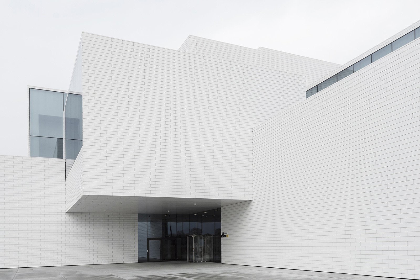
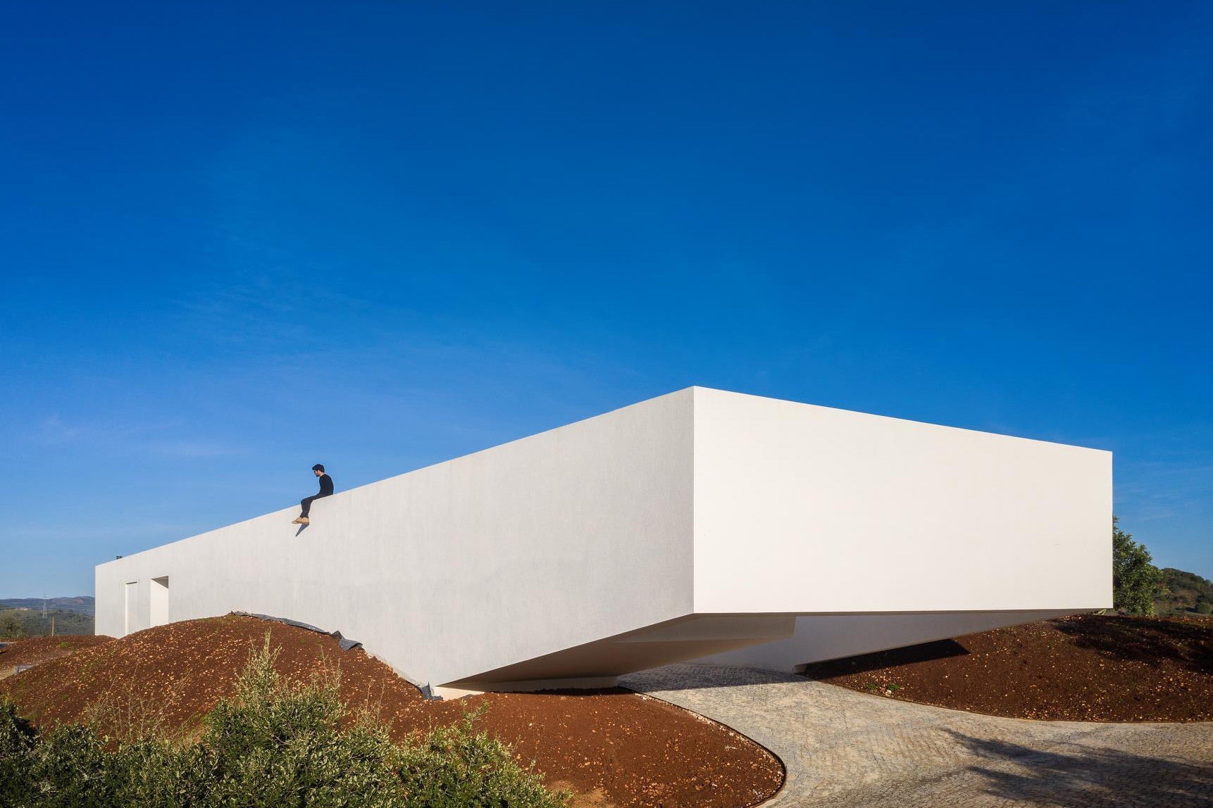
Emerging from the ground, in large white-bricked volumes, mass cantilevers carve out curious voids, beckoning audiences. The Bjarke Ingels Group (BIG) Lego House in Billund, Denmark sees the ethos of what has established Lego as a staple of household play, come to life. Conceived as a place of play, the architecture responds to the physical geometries of the brand’s most successful and important product—the Lego brick.
-
![]()
Since it was developed and launched en masse in 1958, the inherent interlocking capabilities have afforded children, and adults alike, the ability to build, create, and to explore their own curiosities and ideation through the enticement of play. This minimalist and egalitarian manifestation of idea generation is at the centre of the inspiration for the resulting forms.
-
![]()
Sitting west of Copenhagen, in the original birthplace of Lego, Lego House encompasses 21 interlocking blocks, all housing various functions, delineated by their selective coloured roof materiality. Completed in 2017, and taking four years to complete, the spaces contain more than 25 million Lego bricks. The architecture is also designed as an interactive element, where visitors can climb on podiums, explore beyond the external walls and engage directly with the materiality.
-
![]()
Measure refers to the length of a line of text. It is one of the most important aspects of readability. Anything from 45 to 75 characters is widely regarded as a satisfactory length of line for a single-column page… the 66-character line (counting both letters and spaces) is widely regarded as ideal. For multiple-column work, a better average is 40-50 characters.
-
![]()
Line-height affects how easy it is to read a piece of text, so having a well constructed set of values can help make your text easier to read, increasing the chances that people will read it.
-
![]()
Shuffle isn’t just a monolithic template. It’s a big collection of sections that can be mixed and matched or used independently. Use what you need. Leave the rest.
-
![]()
Often times, websites devote a non-trivial amount of css to setting font-size. They declare an unnecessary amount of different font-sizes that upon inspection, don’t come close to resembling a sane type scale.
-
![]()
Line-height affects how easy it is to read a piece of text, so having a well constructed set of values can help make your text easier to read, increasing the chances that people will read it.
-
![]()
Shuffle isn’t just a monolithic template. It’s a big collection of sections that can be mixed and matched or used independently. Use what you need. Leave the rest.
- About
- Journal
- Contact
- # Keep in touch
- support@aristotheme.com
- +90 530 737 2 444
- # Socials
- dribble
- youtube
- About
- Journal
- Contact
- External Link
- # Keep in touch
- support@aristotheme.com
- +90 530 737 2 444


